Monday, January 28, 2013

Photo editing

I'll only put one picture in this post.

Basically, in this assignment I think my color editing skill improved.
At least I know how to use curve with different color, not only RGB.. :)
As you see in the picture below,
the color mood actually changed better after editing..
and I only use few tools for edit. 

Anyway, the color doesn't really looks nice at here..
Lastly, all this picture I used in my artefact :))

Change to Collage?


I always love collage book...
paste all the notes and books...and half way I doing my pinboard design I realise..
my design is look more like collage !! :D
Therefore, I've change my direction..
And I love this :)))

http://www.google.com.my/imgres?hl=en&sa=X&tbo=d&biw=1050&bih=641&tbm=isch&tbnid=F50tRH0AZPgiIM:&imgrefurl=http://aqua-velvet.com/2009/09/open-sketch-book/&docid=l3MHBvBt6zqKIM&imgurl=http://aqua-velvet.com/blog/images/09_sept/02_katie7.jpg&w=567&h=400&ei=MWIHUfjVJsjYrQei9oD4Dg&zoom=1&ved=1t:3588,r:41,s:0,i:214&iact=rc&dur=488&sig=102037409335727120804&page=3&tbnh=174&tbnw=267&start=36&ndsp=17&tx=142&ty=67

http://www.google.com.my/imgres?hl=en&sa=X&tbo=d&biw=1050&bih=641&tbm=isch&tbnid=aFPxQl8nzcIK9M:&imgrefurl=http://www.girlwiththeflower.com/2010/11/sketchbook-collages_26.html&docid=YrJ0K6SYZCPXIM&imgurl=http://oi54.tinypic.com/npnpl1.jpg&w=639&h=425&ei=MWIHUfjVJsjYrQei9oD4Dg&zoom=1&ved=1t:3588,r:24,s:0,i:163&iact=rc&dur=511&sig=102037409335727120804&page=2&tbnh=184&tbnw=267&start=16&ndsp=20&tx=47&ty=95

http://www.google.com.my/imgres?hl=en&sa=X&tbo=d&biw=1050&bih=641&tbm=isch&tbnid=w08i-xTgQ3m3LM:&imgrefurl=http://ajoureblog.com/tag/sketch-book/&docid=4zYQJ5pWCe9hqM&imgurl=http://ajoureblog.com/wp-content/uploads/2010/04/scrapbook3.jpg&w=640&h=480&ei=MWIHUfjVJsjYrQei9oD4Dg&zoom=1&ved=1t:3588,r:22,s:0,i:157&iact=rc&dur=459&sig=102037409335727120804&page=2&tbnh=190&tbnw=245&start=16&ndsp=20&tx=159&ty=25

And I used the image below as my background :) 
So that my background wouldn't be too dull or bored..
and they got lil lovie shapes!!! 
http://www.bigstockphoto.com/image-13557065/stock-vector-umbrella-with-love-wallpaper-design

Besides, used this paper texture to make it as one of my small background where I stick all my photos on it! :D


Layout design/UI of my video


Still headache with my UI design..
Tried to give my video player/flash player a theme so that I can design it easier.

Anyway, still stuck half way.. 


Sunday, January 27, 2013

tutorials on folded/bended paper

Link : http://blog.spoongraphics.co.uk/tutorials/create-a-realistic-page-curl-in-photoshop


tutorial

http://azmind.com/2012/11/11/create-a-nice-green-contact-form-part-1-photoshop/
form

http://www.psdvault.com/drawing/design-a-delicious-contact-me-button-in-photoshop/
buttons

50 tutorials
http://www.antsmagazine.com/photoshop-2/tutorials/50-photoshop-interface-design-tutorials/

PinBoard design?!?

This definitely gonna be my last design and idea : Pinboard ! :D

Why pinboard? 
We usually like to pin our photos, story, our thoughts, ideas, or any favourite image on board..
And I'm sure that most of the pinboard represents a person's story..
or basically they are a story teller..
:)
And of course! They are a person's memories :) 

http://depositphotos.com/4599684/stock-photo-Pinboard---Notice-board.html
http://new-everymorning.blogspot.com/2012/10/day-10-of-31-re-imagine.html

http://bennyzimmermann.com/html/about.html

http://www.glogster.com/1justinluver/pinboard-glog-by-1justinluver/g-6lkeuu58ufvv6iaadei4pa0

http://www.glogster.com/15jordance/pinboard-glog-by-15jordance/g-6l9p6mjjdf49122huv9a4a0


http://www.peppermintpark.com/press/2011/12/09/peppermint-park-all-i-want/pinboard/

http://www.thepeakoftreschic.com/2013/01/blogshop-recap.html

http://scarlettletterphotoblog.blogspot.com/2011/08/revamp-your-pinboard.html


http://enchantedgal-stock.deviantart.com/art/Corkboard-Wood-Cork-Composite-49823242

http://sedart.deviantart.com/art/Cork-Board-80635778

* color scheme *

Found out that color scheme is really a COOL thing! :D
Last time when I deal with all this color problems I use to simply pick some colors from color palette and combine them together..
usually will be, 
pink + purple ;
pink + light pink ;
pink + white ; 
I didnt really think of other colors..
And this time I slowly found out that there are many things I can do to get the best color scheme for my artefact..such as search for some nice color mood photography,
color scheme website, or any graphic / illustration image ..

 I came across this website and they shared few practical tools which they used to select colors. 
I went to one of the website which is design seeds. 
Link : http://www.spaziale.org/?p=1023

First of all, instead of dull type of movie /video play such as youtube.
I would like to have more lovely, romantic type of color scheme since my video is all about couples and their story.. :)
But I guess besides pink color, there are more colors for me to choose...

http://pinterest.com/sherrijames/color-schemes/

This is very tradition type of love story's color. Pinkish...light pink..
soft, comfortable, user friendly..Does not hurt user's eye sight.

https://www.facebook.com/MarketingToBrides

This is quite cherry dark pink color which increase the romantic's feel.
Unfortunately, a video player with only this kind of dark pink will definitely too much for user. 


http://pinterest.com/pin/171699804513388395/

http://www.spaziale.org/?p=1023

I kinda love this combination of color scheme.
Dark pink, purplish pink, muted blue, muted yellow...
I think it's quite a nice combination :)) 
This kind of color scheme gonna looks nice on metalic surface :)))

http://pinterest.com/pin/171699804513388315/

http://design-seeds.com/index.php/P24

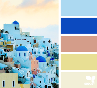
I love all the color schemes in design seeds and found out that most of the colors in it are consider as
"cold color scheme"
which user would probably feel comfortable when they look at it...
Most important is their eye sight allows them to face this kind of color scheme for a long time.
http://design-seeds.com/index.php/P112

Suddenly, feel...color scheme is such an amazing thing :)
:heart:

Saturday, January 26, 2013

Tutorial on Video Edit


I've go through few tutorials on premiere pro in this assignment :D

link : http://www.youtube.com/watch?v=b07dJrMbQnE

Basically, this tutorial teach me how to edit color of my video, achieve kind of film look :D 

We need three way color corrector and levels which is the most important and I've used them in my video edit now :D 
Anyway my "levels" seems quite different from them..

According to what my "experience" classmate and my own "experience" in video editing..
Color of our video are not suppose to be too blueish or greenish..
We are suppose to add more red and yellow, then it's gonna looks much more better :)


So, this is the original color of my video clip :)
Realise it is more to blueish?? And does not looks good. 

So, I've edited it into more yellowish...

And more to red now.
Unfortunately, I feel this seems like video from 70s or 80s...
It's like sepia type of color..! 

Anyway, not gonna continue waste my time on video :)) 
Proceed!!! 

Last tried on videos!


2 days left and I'm not trying my best to make my videos looks perfect.
Erm..Maybe not perfect, just better? 

One mistake I've made in my video shooting.
I didnt get a clip on might or dead cat for audio therefore all I've for the audio part, is NOISE!
and thank GOD!!! Finally I know how to remove the noise!

So, here are two the before and after of my audio waveform. 

Before ( With noise ) 

After ( without noise )


So, gonna show some steps to do this :D
It's quite easy. Just few steps :)

First, pick the noise part which you wanna remove. Just a small part, don have to highlight every part :)


Then, go to effect > noise reduction > and noise reduce process :)


Then click "capture noise print" on the upper right hand side of the pop out window :)


Next, click "select entire file" button which located at the bottom of the graph :)


And yeah!! Last step, "APPLY" and DONE :)


But there's a problem too..After remove all the noises, I can hear echo in the audio which makes me headache. I guess I won't have enough time to fix all this audios... 

But it's happy to learn a new thing :)))


Anyway, I encounter another problem which is the color mood of my video.
Doesn't know what happen to the camera, maybe I just forgot to adjust the white balance on the day I shoot.
All my videos seems to have very dull color mood and their color is more to blue and white which I think is quite difficult for me to edit and get the right color.
I've screen captured and posted 3 videos here just to let you see the differences between them. ( In terms of color. )

First one, is more to red ..


This would be red yellowish.. 

This is obviously quite yellowish..

Problem is, I just don't know which color will be better for the user to watch ~ =.=...
Quite confuse now. 


Monday, January 7, 2013

Color scheme...

Looking for color scheme and realize I'm really a bad designer....

http://www.colourlovers.com/web/trends/websites/6478/We_Heart_Stuff:_Online_Buying_Guide

 http://www.colourlovers.com/web/trends/websites/6329/ARS_LINGUAE_Centar_za_strane_jezike


 http://www.colourlovers.com/web/trends/websites/6706/Web-G_-_Global_Design

 http://www.colourlovers.com/web/trends/websites/6843/Pulmad_peod_lillesalong..._-_Annilill_Peoteenindus

http://www.colourlovers.com/web/trends/websites/7020/Empty_Dump_-_Home


http://www.colourlovers.com/web/trends/websites/6961/middot_LimoonLand_middot


 http://www.colourlovers.com/web/trends/websites/7087/www.bluelimonade.com

http://www.colourlovers.com/web/trends/websites/6960/OrdinaryKids

1st color draft

2nd color draft - Starts to follow color scheme from www.colorlovers.com


Blog Template by YummyLolly.com